Wednesday, September 29, 2010

Four Elements Website


http://hills.ccsf.edu/~agomez41/four_elements/elemental_living.html 

This is my first effort at writing HTML to make a full website. I had a lot of fun with this assignment and tried to briefly incorporate most of the different aspects of web design that HTML offers. My concept for the website was to include a page for each element and how I interact with that element in my life.

For the basic design of the website, I used a combination of horizontal and vertical frames. I made two horizontal frames to have a fixed heading for the site. I then divided the lower horizontal frame into two vertical frames and set the left frame as a navigation frame. On the navigation frame, I put links to the four elements pages plus the home page. When a visitor clicks on the links, the corresponding pages appear on the right vertical frame. Thus, I have a fixed heading and navigation frame, so the visitor can go to any page in the site at any time.

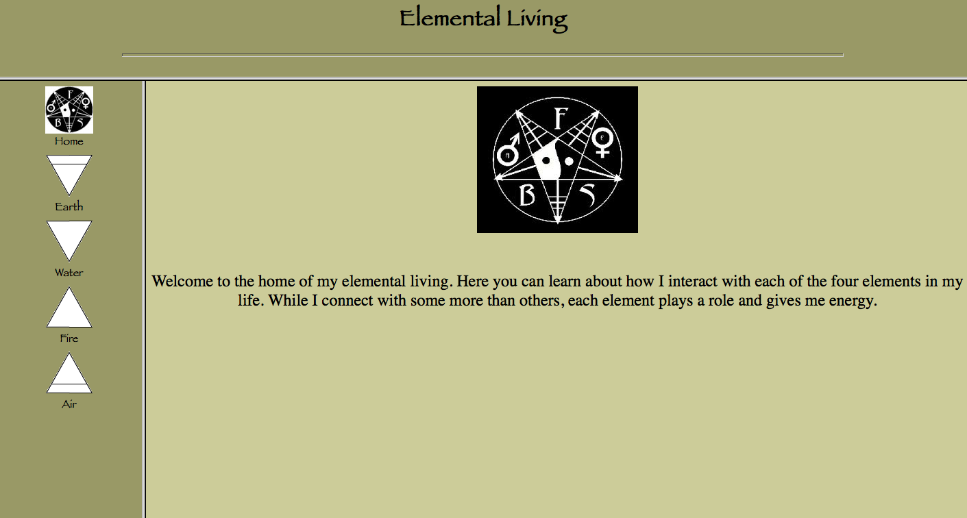
For each element, I used an image of myself interacting with that element and a brief explanation of how I feel about each element. For the Air and the Water element pages, I used tables to align the text and the picture, because I wanted the entire page to be viewable from a regular sized browser window. For the elemental symbols which I used as links in the navigation frame, I used Adobe Illustrator to create small, uniform vector symbols. The home page symbol I found online.

I also included two sounds, one of waves and one of fire crackling, on the respective elemental pages. I found these sounds at freesound.org. I embedded the sounds, and using the autostart, loop, height and width attributes, I made it so the sounds would start immediately upon loading, loop continuously, and the controls would not be visible (because I didn't like how it looked).

I also used a little bit of CSS on the navigation frame to make the links appear black and un-underlined.

Wednesday, September 15, 2010

Final Illustrator Invitation


I made this flyer for my mother's middle school band class, and it will be posted around the school and sent to hundreds of parents and sponsors. My idea was to create a clean, easy to understand flyer that is visually appealing to middle school students. I used a large font with a red fill, thicker stroke, and bulge adjustment to create a Dr. Seuss-esque title that really grabs the eye and evokes a fun feeling. I included a vector image of a saxophone that I found on the web. Using the brush tool, I drew sweeping lines coming out of the saxophone. I then used these lines to type along a path in musical notes and text fonts. To finish off the flyer and add more cohesion, I added a small black-to-white gradient in the corner and tilted it to expand diagonally.

To identify the school and the Band organization, I wanted to create a logo that the band could use for future publications as well. The school's mascot is a panther, so I found a panther vector on the web. I liked this image because it had very clean lines and spaces that text could easily fit along with. Using the same technique as in the flyer, I added musical notes and text.

Saturday, September 11, 2010

Real Final Self Portrait


I wasn't quite satisfied with my first "final" self portrait, so in my free time I went back and made another copy that was more what my original concept had been. The basic steps that I took to create this version were:

  • When I restarted the project, I set the document to 8 bit, rather than 32 bit color, so the colors and layers did not have to be flattened when I saved as a jpeg.
  • I used a combination of the Magic Wand and the Magnetic Lasso tools to select around the red/purple drawing, so the white background from the scan wasn't part of the layer.
  • I used the Magnetic Lasso tool to select the round red part of my drawing. I then copied that to select the same size and shape around the picture of my face in the ocean.
  • I adjusted the levels, brightness and contrast to make my face stand out more in the picture.
  • I used various text adjustments to make my text interact with the shape of the drawing.
  • I used the Paint Brush tool to draw a looping line to connect all the aspects of the self portrait and to show the order of the text. 
  • I then copied that layer, made it a different color, moved it down a few notches, and erased parts of it to create the highlighting of that looping line.
  • I found a picture of an old, yellowed piece of paper on the Internet and put it as my background, with 50% opacity.

Wednesday, September 8, 2010

Final Self Portrait


In this self portrait, I combined three items from my life that I have always felt were very important and in some way speak to what is central about me. The first is something I wrote when I was 13 and have had on my wall ever since. The writing is simple and rather formulaic, but it speaks to a basic philosophy of life that I hold, which is to experience all aspects of life freely and with joy. The second item in this self portrait is a pastel drawing that I made when someone asked me to "draw my soul." The red and purple plant-like design is what I came up with, and shows my appreciation of the elegant beauty of living things. The third item in this self portrait is a picture that a friend took of me. She double-exposed a picture of me with one of the ocean, and I like the created effect of me coming out of the ocean. I then used the paint brush to draw a looping line to connect all of these items and to show the order of the text.